Summary
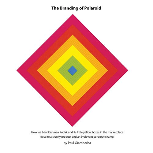
Paul Giambarba’s account concerns the corporate image and product identity of Polaroid, where he worked as a designer and its first art director. His subject is the visual identity developed around the company’s cameras and film, including the color stripes associated with its packaging. Giambarba describes the work from a participant’s position, shaped by his relationship with executives and other designers inside the business. In a separate Dazed interview, he discusses changes in design authority and his later separation from Polaroid. It offers a focused view of Polaroid’s branding during Land’s era, placing visual design and the people who supported it within the company story.
Why read it Our view
Use the book’s branding focus alongside Giambarba’s separate interview to examine packaging and product identity. Compare the designer’s view with other company histories.
Written about
- Edwin LandParticipant company branding historyGiambarba’s account covers the product identity and packaging he helped create at Polaroid. This is a participant’s company-design history; no reading, approval or endorsement by Land is claimed. Content evidence comes from the author’s description and a separate interview; no interior was inspected.Source